Demystifying Viewing Patterns

Have you ever monitored the viewing pattern of people visiting your website? This is the pattern in which people view, in this case, websites. There are a lot of ideas about this out there. Now I’m wondering: is there one ‘right’ pattern? Can we somehow turn all the results of research about this into one optimized website? In other words: is there one pattern we should follow when designing our product and landing pages? Unfortunately, it seems there isn’t one ‘golden rule’ for this. These kinds of patterns are subject to culture and education. Most probably the patterns are also vastly different for languages that are read from right to left. And of course, it could be different for men and women as well.
That doesn’t mean studying the behavior of your visitors isn’t interesting. Your target audience might be a specific group, consisting of people that follow one of these patterns. Which means you can optimize for them.
Viewing patterns
There are numerous patterns out there. The aim of this post is to shed some light on these and help you recognize them. The most important ones we found, or what I feel are the most common ones, are these three:
- The F-Pattern
- The Gutenberg Diagram
- The Z-pattern
The F-pattern
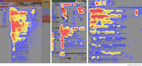
This is probably the one most people know. As the name already infers, the F-pattern suggests that people’s viewing pattern of a website is similar to the shape of an F:

Users will view the top content of a page horizontally first. After this, their view will go down the page, and they’ll view another part horizontally. However, this area of horizontal viewing will usually be smaller than the top viewing area. Users will end up just ‘scanning’ the left side of the page’s content (best shown in the middle screenshot).
Now this F-Pattern is very different from the next two viewing patterns. It focuses mainly on the left reading line of a site, whereas in the Gutenberg Diagram and Z-Pattern the user ‘finishes’ at the lower right corner of a page.
The Gutenberg Diagram
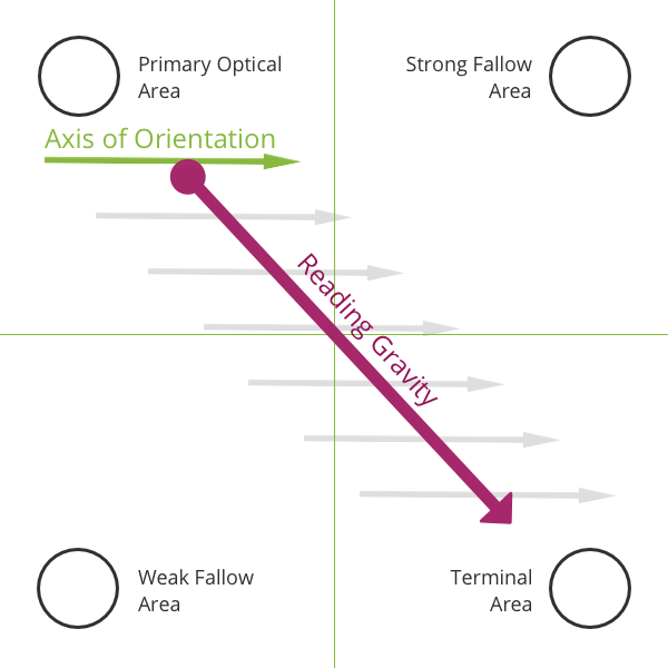
The Gutenberg Diagram suggests that people are subject to a ‘reading gravity’ that goes directly from the top left of a page to the bottom right:

Users will start at the top left of a page, and end at the bottom right of a page. However, they don’t do this by viewing everything: the Gutenberg Diagram suggests that users go there in a straight line, almost just scanning the page.
To make things more complicated, the ‘Axis of Orientation’ is from left to right, making the top right area more likely to be noticed, and therefore stronger, than the bottom left.
The Z-pattern
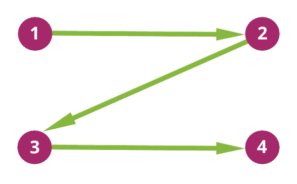
Like the F-pattern, the name of the Z-pattern already gives away its meaning. It suggests that people view a website’s content in the shape of a Z. The pattern is also known as the inverted S-pattern:

This viewing pattern presents a more engaged reading path. People viewing a website like this will see every part of the website. The start and the endpoints are the same as in the Gutenberg Diagram, but the top right and bottom left will not be disregarded as easily.
Nick Babich has written a clear post on UX Planet about this Z-Pattern you should read.
Other viewing patterns
There are several others, but for the sake of keeping this post readable, we’ll only mention them. They all have great similarities with one of the patterns explained above. There’s the Golden Triangle Pattern, which is very similar to the F-pattern. And there’s the Zig Zag Pattern, which is basically just a lot of Z-patterns underneath each other. This is usually a viewing pattern for the most engaged form of reading: people searching for something specific.
Structure and hierarchy
There are a lot of patterns and a lot of ideas of how people are viewing websites. But what can we learn from all of them?
We’re inclined to believe that the way people view a page is dictated by the structure and hierarchy of that page they’re viewing, as well as personal preference. This idea has been around for ages. In fact, researchers concluded the same in 2004, saying:
The present research confirmed previous work in that individual characteristics of the viewer as well as the stimuli both contribute to viewers’ eye movement behavior.
So, viewing patterns could mean something when people are viewing a website that lacks a clear hierarchy. But as soon as you add focus and hierarchy to your website, people will start following that hierarchy. Several other researchers all reported similar findings.
The ‘structure’ of a page is made clear by the ‘viewing heatmaps’, as we’ve seen with the F-pattern. A lot of these studies focused on search result pages, which are already content heavy on the left side. So people will obviously view the left side of those pages more. However, if you add a ‘heavy’ or large object, whether textual or visual, to the right side, people’s eyes will almost certainly be drawn to that. So, how you’ve structured the design of your page will direct how people view your page.
In our post about image SEO, I mentioned that images should be aligned to the right, or should be full-width, to maintain the left reading line. This makes perfect sense if your visitors follow this F-Pattern. By the way, in all patterns, images can be directives for that viewing pattern, as also highlighted in this post: Visually direct and captivate your visitors.
Similarities
All these patterns are, in their basis, very similar. So similar, in fact, that UX Movement reviewed the Gutenberg Diagram without discussing the axis of orientation, which makes it a clear Z-pattern.
The patterns have different names, but you can’t ignore the fact that they all start in the top left. And from the top left, they move to the right. This is either the top right or bottom right. We shouldn’t need research to know that, because most people in the western world read from left to right. There is a reason your favorite webshop’s titles and buy buttons follow that viewing pattern!
What should we do with this information?
My advice to you is to have a clear structure on your pages, with a clear hierarchy. Don’t let yourself get distracted too much by specific viewing patterns, and definitely don’t read too much into them.
The best way to go is probably to have some people, who are representative of your website’s visitors, work their way around your site. This will give you far more insight than generic patterns and/or studies like the ones mentioned above. Every website is different; every audience has its own characteristics. Find out what practices fit your website!
Read more: About headlines and taglines »

